IF YOU WOULD LIKE TO GET AN ACCOUNT, please write an
email to Administrator. User accounts are meant only to access repo
and report issues and/or generate pull requests.
This is a purpose-specific Git hosting for
BaseALT
projects. Thank you for your understanding!
Только зарегистрированные пользователи имеют доступ к сервису!
Для получения аккаунта, обратитесь к администратору.
Although some features are mixed together in this PR, this PR is not
that large, and these features are all related.
Actually there are more than 70 lines are for a toy "test queue", so
this PR is quite simple.
Major features:
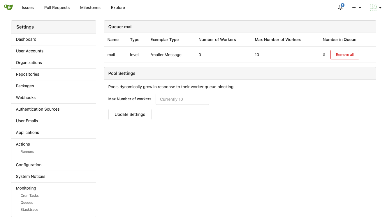
1. Allow site admin to clear a queue (remove all items in a queue)
* Because there is no transaction, the "unique queue" could be corrupted
in rare cases, that's unfixable.
* eg: the item is in the "set" but not in the "list", so the item would
never be able to be pushed into the queue.
* Now site admin could simply clear the queue, then everything becomes
correct, the lost items could be re-pushed into queue by future
operations.
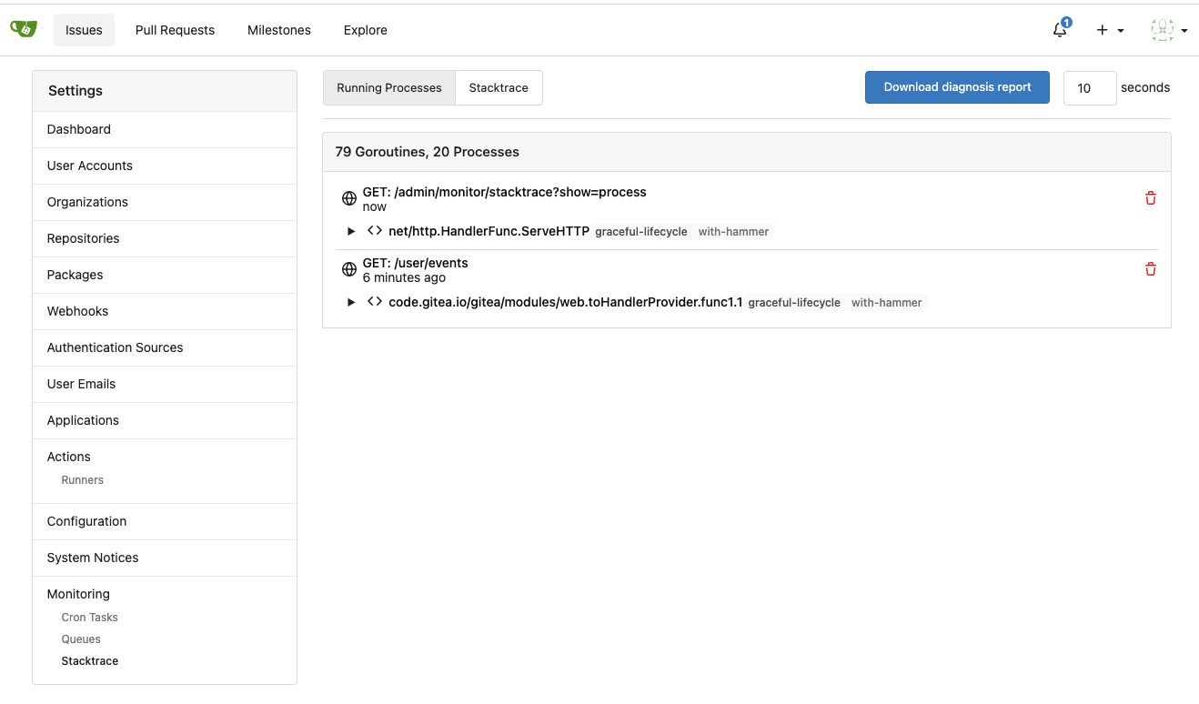
3. Split the "admin/monitor" to separate pages
4. Allow to download diagnosis report
* In history, there were many users reporting that Gitea queue gets
stuck, or Gitea's CPU is 100%
* With diagnosis report, maintainers could know what happens clearly
The diagnosis report sample:
[gitea-diagnosis-20230510-192913.zip](https://github.com/go-gitea/gitea/files/11441346/gitea-diagnosis-20230510-192913.zip)
, use "go tool pprof profile.dat" to view the report.
Screenshots:


---------
Co-authored-by: Jason Song <i@wolfogre.com>
Co-authored-by: Giteabot <teabot@gitea.io>
After #24317 this function is only used in one place where it is not
needed. I confirmed the timestamp still renders correctly

Signed-off-by: Yarden Shoham <git@yardenshoham.com>
This refactors the `shared/datetime/short|long|full` templates into a
template helper function, which allows us to render absolute date times
within translatable phrases.
- Follows #23988
- The first attempt was in #24055
- This should help #22664
Changes:
1. Added the `DateTime` template helper that replaces the
`shared/datetime/short|long|full` templates
2. Used find-and-replace with varying regexes to replace the templates
from step 1 (for example, `\{\{template "shared/datetime/(\S+) \(dict
"Datetime" ([^"]+) "Fallback" ([^\)]+\)?) ?\)?\}\}` -> `{{DateTime "$1
$2 $3}}`)
3. Used the new `DateTime` helper in the issue due date timestamp
rendering
# Before

# After

---------
Signed-off-by: Yarden Shoham <git@yardenshoham.com>
Co-authored-by: wxiaoguang <wxiaoguang@gmail.com>
Follow:
* #23574
* Remove all ".tooltip[data-content=...]"

Major changes:

* Remove "tooltip" class, use "[data-tooltip-content=...]" instead of
".tooltip[data-content=...]"
* Remove legacy `data-position`, it's dead code since last Fomantic
Tooltip -> Tippy Tooltip refactoring
* Rename reaction attribute from `data-content` to
`data-reaction-content`
* Add comments for some `data-content`: `{{/* used by the form */}}`
* Remove empty "ui" class
* Use "text color" for SVG icons (a few)
* Refactor `i18n` to `locale`

- Currently we're using the `i18n` variable naming for the `locale`
struct. This contains locale's specific information and cannot be used
for general i18n purpose, therefore refactoring it to `locale` makes
more sense.
- Ref: https://github.com/go-gitea/gitea/pull/20096#discussion_r906699200

* Update routers/install/install.go
* Prototyping

* Start work on creating offsets

* Modify tests

* Start prototyping with actual MPH

* Twiddle around

* Twiddle around comments

* Convert templates

* Fix external languages

* Fix latest translation

* Fix some test

* Tidy up code

* Use simple map

* go mod tidy

* Move back to data structure

- Uses less memory by creating for each language a map.

* Apply suggestions from code review

Co-authored-by: delvh <dev.lh@web.de>

* Add some comments

* Fix tests

* Try to fix tests

* Use en-US as defacto fallback

* Use correct slices

* refactor (#4)

* Remove TryTr, add log for missing translation key

* Refactor i18n

- Separate dev and production locale stores.
- Allow for live-reloading in dev mode.

Co-authored-by: zeripath <art27@cantab.net>

* Fix live-reloading & check for errors

* Make linter happy

* live-reload with periodic check (#5)

* Fix tests

Co-authored-by: delvh <dev.lh@web.de>
Co-authored-by: 6543 <6543@obermui.de>
Co-authored-by: wxiaoguang <wxiaoguang@gmail.com>
Co-authored-by: zeripath <art27@cantab.net>
Start making the mobile experience not painful and be actually usable. This contains a few smaller changes to enhance this experience.

- Submit buttons on the review forms aren't columns anymore and are now allowed to be displayed on one row.
- The label/milestone & New Issue buttons were given each own row even tough, there's enough place to do it one the same row. This commit fixes that.
- The issues+Pull tab on repo's has a third item besides the label/milestone & New Issue buttons, the search bar. On desktop there's enough place to do this on one row, for mobile it isn't, currently it was using for each item a new row. This commits fixes that by only giving the searchbar a new row and have the other two buttons on the same row.
- The notification table will now be show a scrollbar instead of overflow.
- The repo buttons(Watch, Star, Fork) on mobile were showing quite big and the SVG wasn't even displayed on the same line, if the count of those numbers were too high it would even overflow. This commit removes the SVG, as there isn't any place to show them on the same row and allows them to have a new row if the counts of those buttons are high.
- The admin page can show you a lot of interesting information, on mobile the System Status + Configuration weren't properly displayed as the margin's were too high. This commit fixes that by reducing the margin to a number that makes sense on mobile.
- Fixes to not overflow the tables but instead force them to be scrollable.
- When viewing a issue or pull request, the comments aren't full-width but instead 80% and aligned to right, on mobile this is a annoyance as there isn't much width to begin with. This commits fixes that by forcing full-width and removing the avatars on the left side and instead including them inline in the comment header.
As discussed on #19221 we should store the results of the last task message on the
crontask and show them on the monitor page.

Signed-off-by: Andrew Thornton <art27@cantab.net>
Co-authored-by: wxiaoguang <wxiaoguang@gmail.com>