IF YOU WOULD LIKE TO GET AN ACCOUNT, please write an
email to Administrator. User accounts are meant only to access repo
and report issues and/or generate pull requests.
This is a purpose-specific Git hosting for
BaseALT
projects. Thank you for your understanding!
Только зарегистрированные пользователи имеют доступ к сервису!
Для получения аккаунта, обратитесь к администратору.
- Update all JS dependencies
- Enable stylint
[`media-feature-name-value-no-unknown`](https://stylelint.io/user-guide/rules/media-feature-name-value-no-unknown)
- Make use of new features in webpack and text-expander-element
- Tested Swagger and Mermaid

To explain the `text-expander-element` change: Before this version, the
element added a unavoidable space after emoji completion. Now that
https://github.com/github/text-expander-element/pull/36 is in, we gain
control over this space and I opted to remove it for emoji completion
and retain it for `@` mentions.

---------

Co-authored-by: Giteabot <teabot@gitea.io>
1. Remove unnecessary `btn-link` `muted` classes
* Link is link, button is button, I can't see a real requirement to make
a button like a link.
* If anyone insists, please help to show me real example from modern
frameworks / websites, how and why they do so.
* No need to duplicate a lot of class names on similar elements
* Declare styles clearly, for example, `markdown-toolbar` itself should
have `display: flex`, but not use `gt-df` to overwrite the `display:
block`.
2. Remove unnecessary `role` attribute
* https://github.com/github/markdown-toolbar-element/issues/70
* The `markdown-toolbar-element` does want to add `role=button`, but
there is a bug.
* So we do the similar thing as upstream does (add the role by JS),
until they fix their bugs.
3. Indent `markdown-switch-easymde` (before it doesn't have a proper
indent)
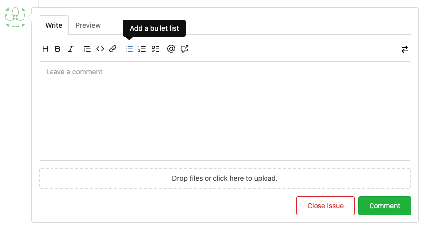
Screenshot:

Followup of #23876 according to my unreleased review demanding tooltips.
Additionally
- add a `muted` equivalent for buttons
- convert `switch to legacy` to an actual button
- enroll `switch to legacy` in the builtin pseudo focus cycle
- remove spaces between the buttons
The effect of the `muted` class is what you would expect: The button
loses all of its normal styling, and is defined only by its content instead.
This will help reduce a11y infractions in the future, as that was one of
the major points why people didn't use `<button>` tags and decided on a
bad fix (i.e. through `<div>`s) instead.
## Appearance

---------
Co-authored-by: silverwind <me@silverwind.io>
- Add placeholders and aria-label all input fields on these two pages
- Add margin before wiki change message
- Remove labels from release page, replacing them with aria-label
The completion popup now behaves now much more as expected than before
for the raw textarea:
- You can press <kbd>Tab</kbd> or <kbd>Enter</kbd> once the completion
popup is open to accept the selected item
- The menu does not close automatically when moving the cursor
- When you delete text, previously correct suggestions are shown again
- If you delete all text until the opening char (`@` or `:`) after
applying a suggestion, the popup reappears again
- Menu UI has been improved

<img width="278" alt="Screenshot 2023-04-07 at 19 43 42"
src="https://user-images.githubusercontent.com/115237/230653601-d6517b9f-0988-445e-aa57-5ebfaf5039f3.png">